In November, 2025. ironically a day before my birthday (unbeknownst to the donor), I was given two books that were illustrated by Gorey. The present was wrapped with high quality wrapping paper… paper good enough to be book binding liner, a white ribbon, a beautiful note card with a readable handwritten note, a print-out of a New Yorker article about Gorey, and two books given to this donor in the 1960s by a classmate in the State Graduate School of Art who later went on to become a director of an art museum. After I unwrapped it on my birthday, the contents sat on our kitchen table for weeks reminding me to send thanks and to revel in the splendor of an extremely thoughtful gift.
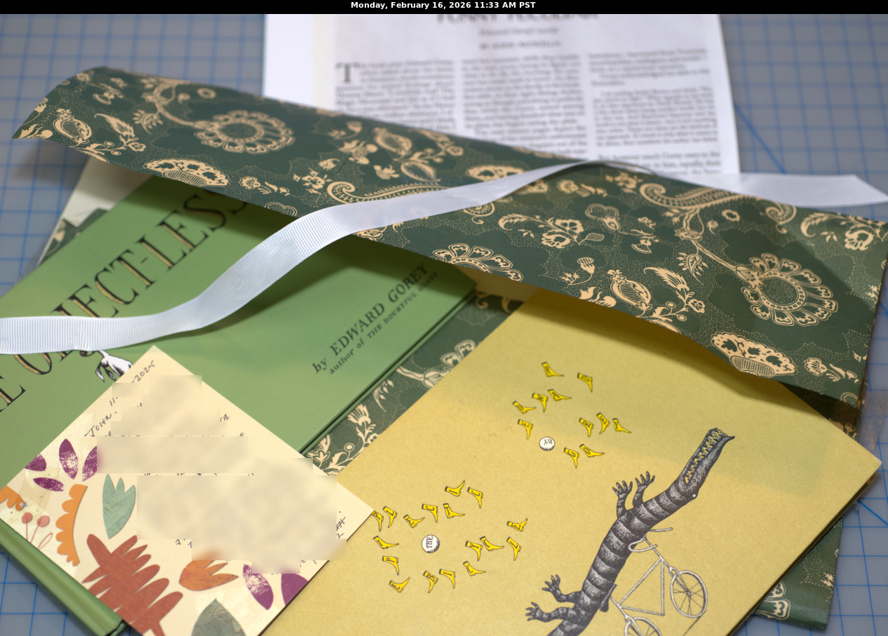
The books are:
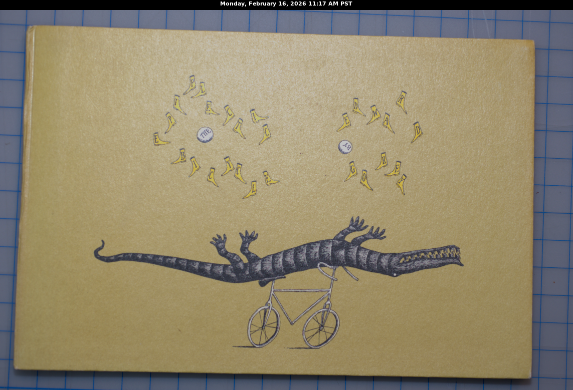
- Gorey, Edward, The Epiplectic Bicycle, (New York: Congdon & Weed). ISBN 0-312-92185-3.
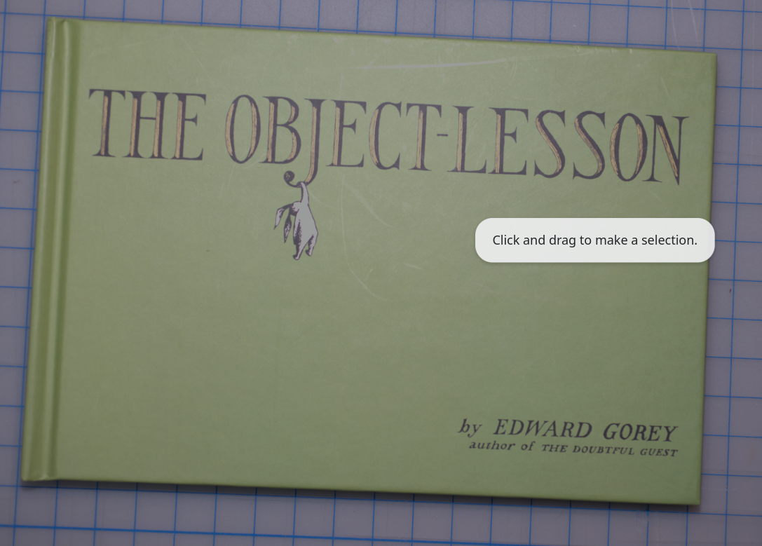
- Gorey, Edward, The Object Lesson, (New York: Harcourt: 1958). ISBN 0-150100709-8.
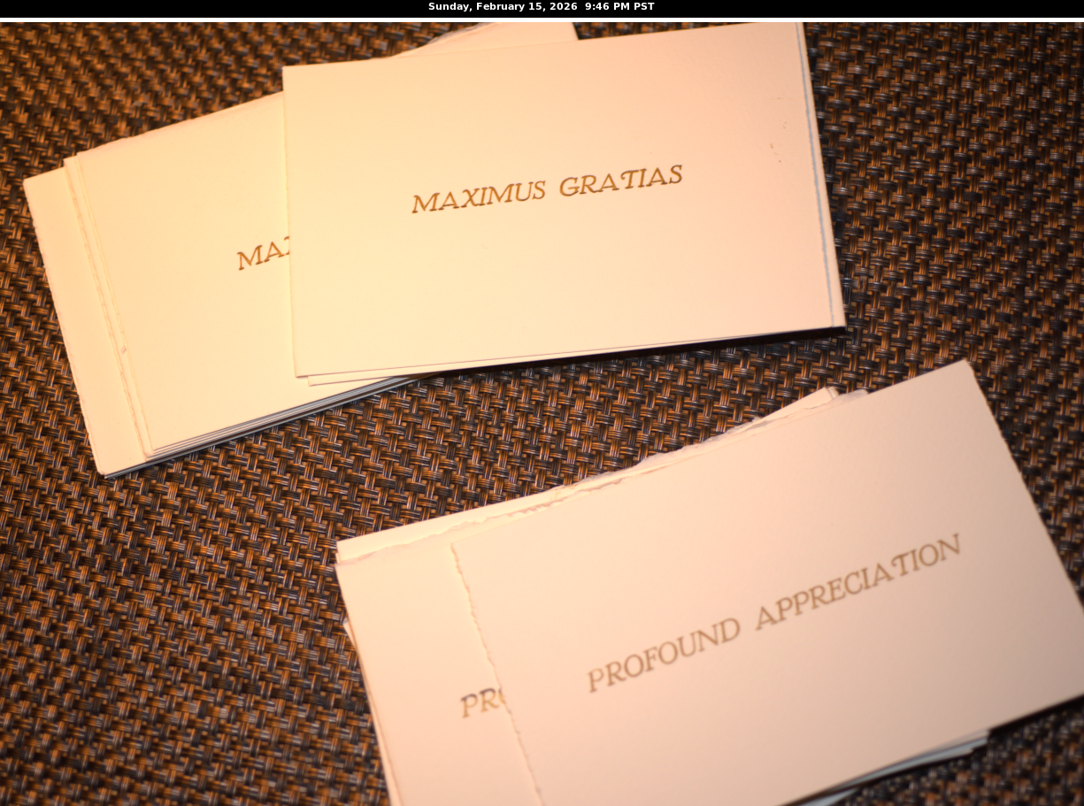
I was so touched and appreciative that i felt compelled to go the extra mile and create new and “suitable” cards on my letterpress with which to convey my gratitude. Unfortunately, the decline and loss of Winnie (12/19/26), our golden retriever who sang with me while I played piano, affected me deeply and stymied my creative drive. (Winnie had a very discerning repertoire, including the Finale of César Franck’s Piano Trio No. 1— I finally started playing piano again recently as I had been mourning and I can still hear her sing at her favorite intervals when I play through the movement) and here it is almost 3 months later, and after Valentine’s Day, and my promised note (I immediately thanked her in an email with the words “note to follow”) had not been sent out. Since I was given two books and the almost unforgivable lapse of time to send mandatory written thanks, I feel two notes, not one, are in order and the notes cannot be the same. So I wrote a note for each book duly thanking her.
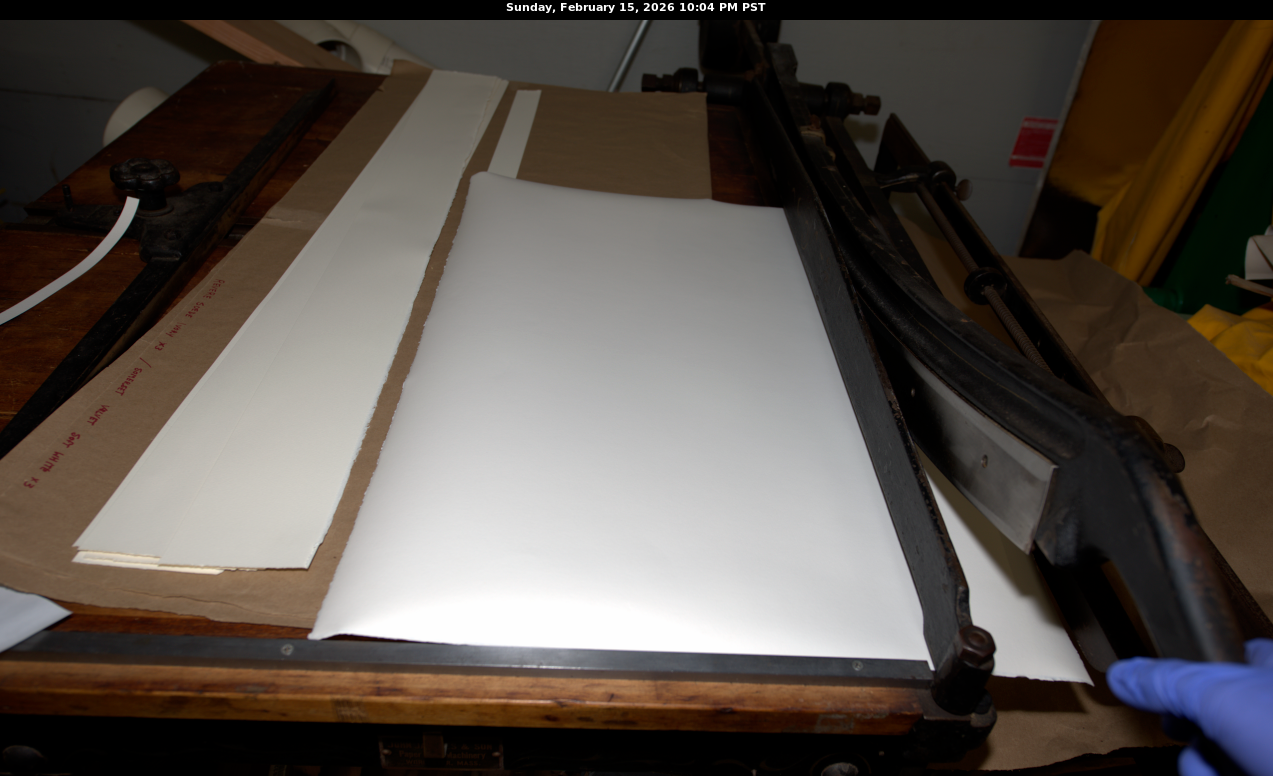
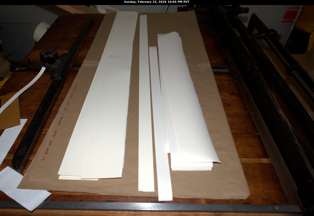
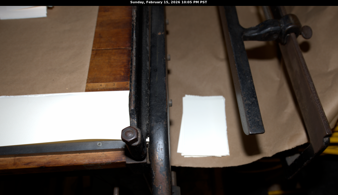
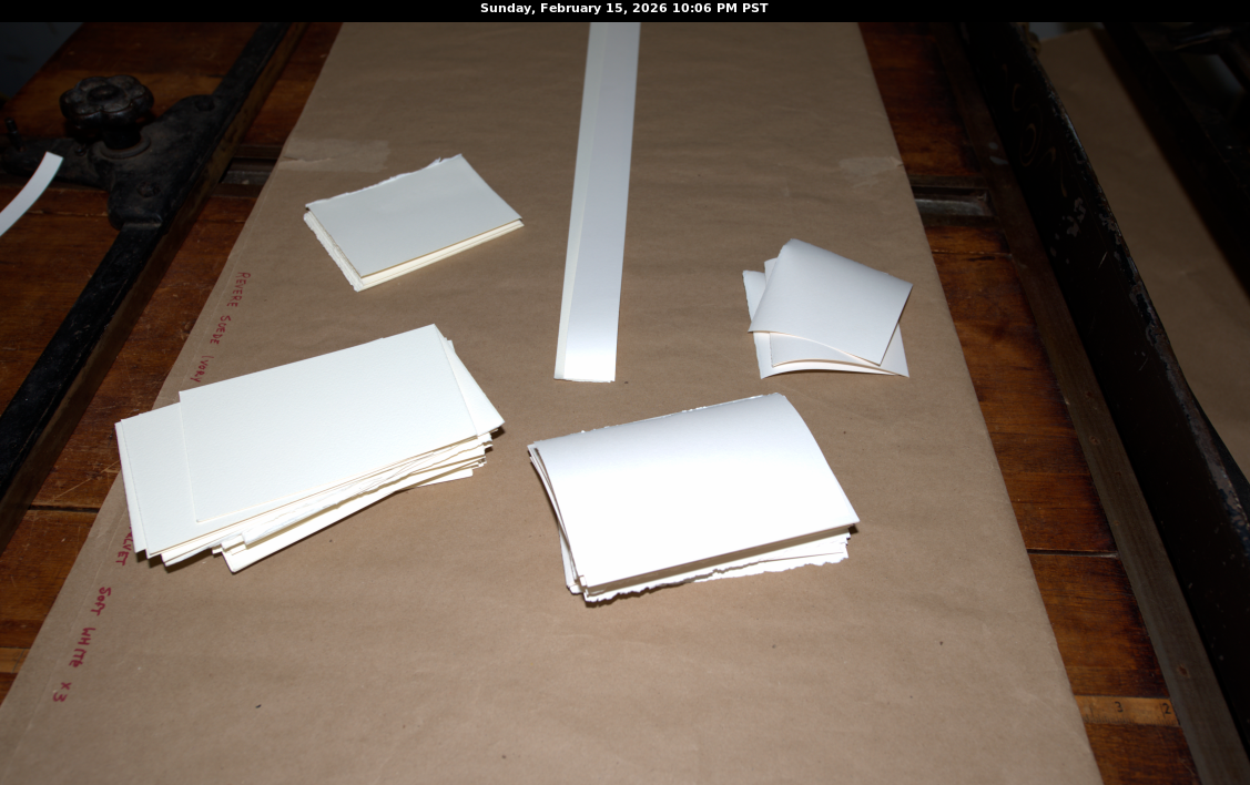
So, with my Jacques shear I cut special paper into note card size.
Then I decided on the wording to use for the cards:
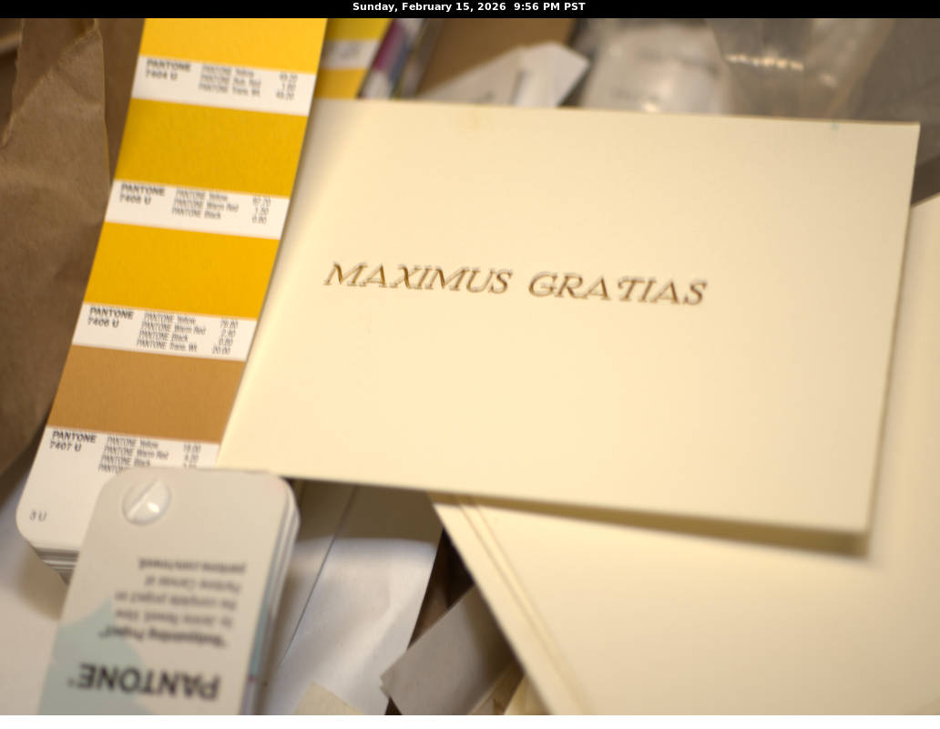
- Maximus Gratis
- Profound Appreciation
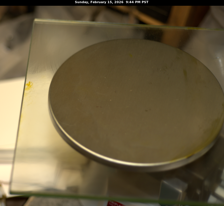
I selected a PANTONE ink that resembles gold, #7407 U[ncoated] (approved by my architect wife) whose formula is:
-
PANTONE Yellow 18.00%
-
PANTONE Warm Red 4.20%
-
PANTONE Black 2.80%
-
PANTONE Translucent White 75.0%
Laying out the globs of ink. The ink is like taffy, and not very tasty.
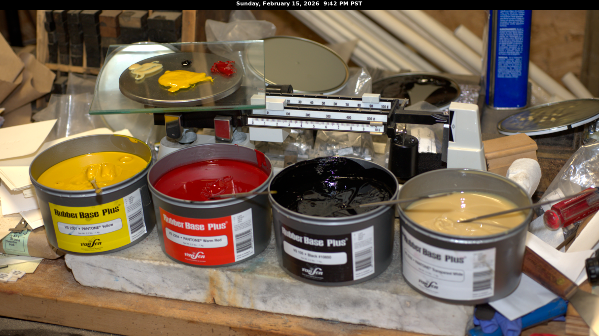
I have 1/4″ glass plates used for mixing inks and set the plate on a scale with a 500 gram weight so I could approximate in grams a batch of ink consisting of 10 grams. Unfortunately, this analog scale does not have the precision of 2 decimal places, so I’ll have to procure a digital so I can be more precise is measuring the inks according to the percentages specified by Pantone.

Am I close to #7407 U[ncoated]?
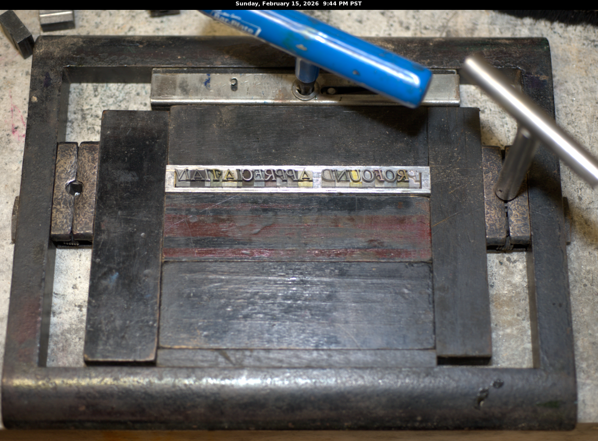
I fired up my letterpress. First I have to set the lead type and then place it in the letterpress’s chase:
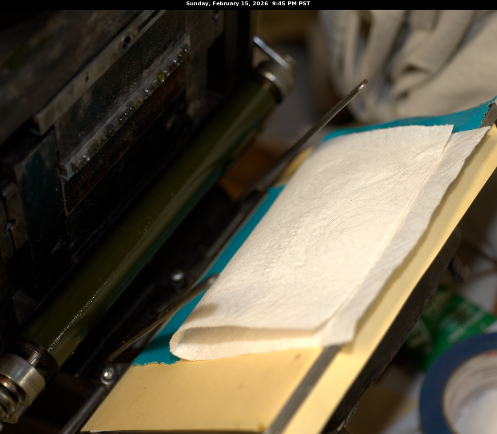
Then I perform a test print on paper towel:
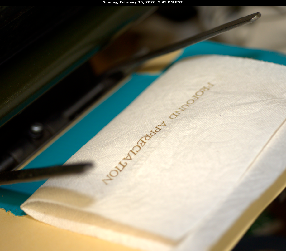
After the impression:
Here are two runs:
Clean up is a bitch, you have to clean and clean and clean. And with Naptha… sigh. Cleanliness is godliness in letterpress work. You can still see a yellow tinge on the glass plate as well as a smudge of yellow ink that did not get mixed in.
I have a table top Sigwalt Ideal #5 which has a 6 x 9″ chase size. I also have a 2,000 lb + dangerous Kluge monster (3 phase) with a 10 x 15″ chase.
Leave a Reply